posts > stats
Understanding HDBSCAN and Density-Based Clustering

HDBSCAN is a clustering algorithm developed by Campello, Moulavi, and Sander [8]. It stands for “Hierarchical Density-Based Spatial Clustering of Applications with Noise.”
In this blog post, I will try to present in a top-down approach the key concepts to help understand how and why HDBSCAN works. This is meant to complement existing documentation such as sklearn’s “How HDBSCAN works” [1], and other works and presentations by McInnes and Healy [2], [3].
This blog post has been published in KDNuggets and Towards Data Science
No (few) assumptions except for some noise

Let’s start at the very top. Before we even describe our clustering algorithm, we should ask, “what type of data are we trying to cluster?”
We want to have as few assumptions about our data as possible. Perhaps the only assumptions that we can safely make are:
- There is noise in our data
- There are clusters in our data which we hope to discover
Clustering data set
To motivate our discussion, we start with the data set used in [1] and [3].
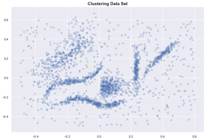
With only 2 dimensions, we can plot the data and identify 6 “natural” clusters in our dataset. We hope to automatically identify these through some clustering algorithm.
K-means vs HDBSCAN
Knowing the expected number of clusters, we run the classical K-means algorithm and compare the resulting labels with those obtained using HDBSCAN.
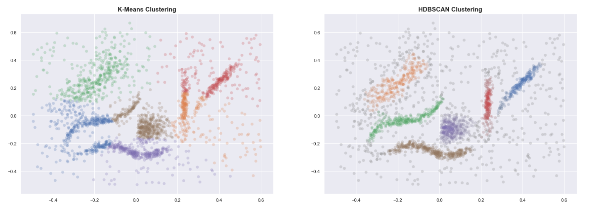
Even when provided with the correct number of clusters, K-means clearly fails to group the data into useful clusters. HDBSCAN, on the other hand, gives us the expected clustering.
Why does K-means fail?
Briefly, K-means performs poorly because the underlying assumptions on the shape of the clusters are not met; it is a parametric algorithm parameterized by the K cluster centroids, the centers of gaussian spheres. K-means performs best when clusters are:
- “round” or spherical
- equally sized
- equally dense
- most dense in the center of the sphere
- not contaminated by noise/outliers
Let us borrow a simpler example from ESLR [4] to illustrate how K-means can be sensitive to the shape of the clusters. Below are two clusterings from the same data. On the left, data was standardized before clustering. Without standardization, we get a “wrong” clustering.
![Figure 14.5 from ESLR chapter 14 [4]. Clusters from standardized data (left) vs clusters from raw data (right).](https://cdn-images-1.medium.com/max/800/1*gzRRGby6vq6buR1SlzGaJg.png) Figure 14.5 from ESLR chapter 14 [4]. Clusters from standardized data (left) vs clusters from raw data (right).
Figure 14.5 from ESLR chapter 14 [4]. Clusters from standardized data (left) vs clusters from raw data (right).
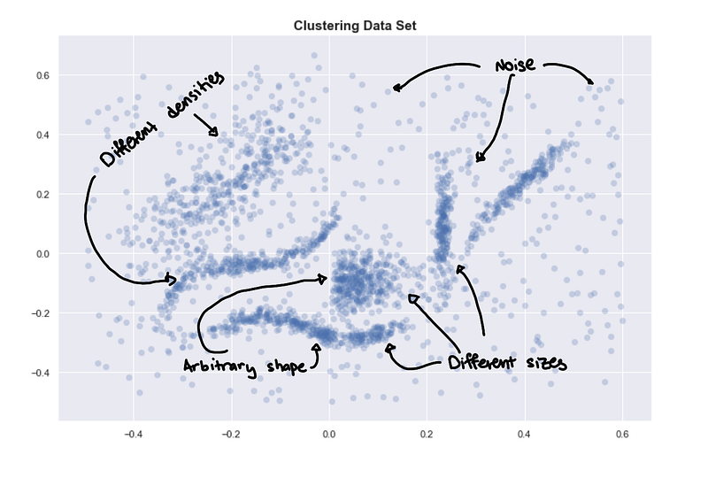
What are the characteristics of our data?
We go back to our original data set and by simply describing it, it becomes obvious why K-means has a hard time. The data set has:
- Clusters with arbitrary shapes
- Clusters of different sizes
- Clusters with different densities
- Some noise and maybe some outliers
Need robustness for data exploration
While each bullet point can be reasonably expected from a real-world dataset, each one can be problematic for parametric algorithms such as K-means. We might want to check if the assumptions of our algorithms are met before trusting their output. But, checking for these assumptions can be difficult when little is known about the data. This is unfortunate because one of the primary uses of clustering algorithms is data exploration where we are still in the process of understanding the data
Therefore, a clustering algorithm that will be used for data exploration needs to have as few assumptions as possible so that the initial insights we get are “useful”; having fewer assumptions make it more robust and applicable to a wider range of real-world data.
Dense regions and multivariate modes

Now, we have an idea what type of data we are dealing with, let’s explore the core ideas of HDBSCAN and how it excels even when the data has:
- Arbitrarily shaped clusters
- Clusters with different sizes and densities
- Noise
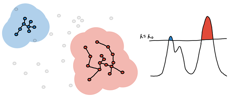
HDBSCAN uses a density-based approach which makes few implicit assumptions about the clusters. It is a non-parametric method that looks for a cluster hierarchy shaped by the multivariate modes of the underlying distribution. Rather than looking for clusters with a particular shape, it looks for regions of the data that are denser than the surrounding space. The mental image you can use is trying to separate the islands from the sea or mountains from its valleys.
What’s a cluster?
How do we define a “cluster”? The characteristics of what we intuitively think as a cluster can be poorly defined and are often context-specific. (See Christian Hennig’s talk [5] for an overview)
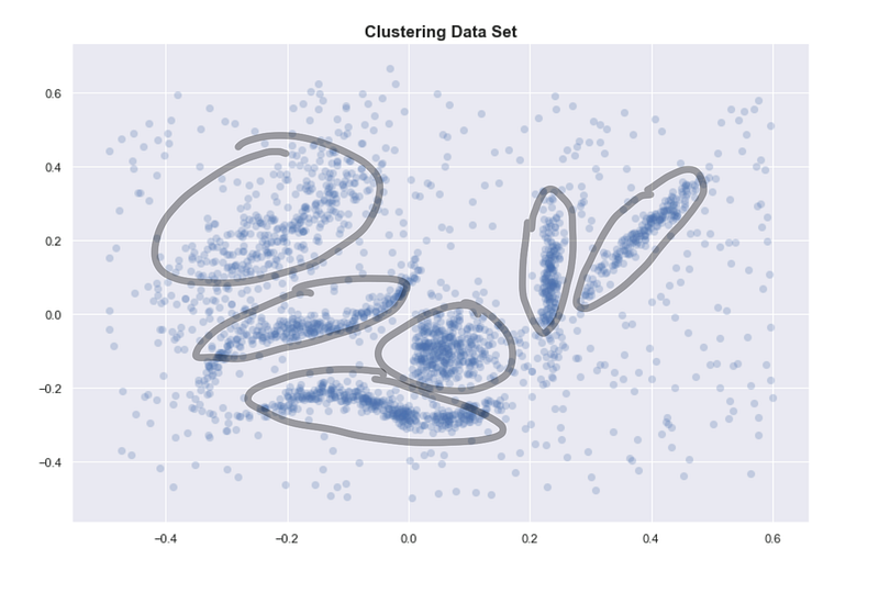
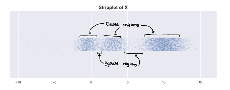
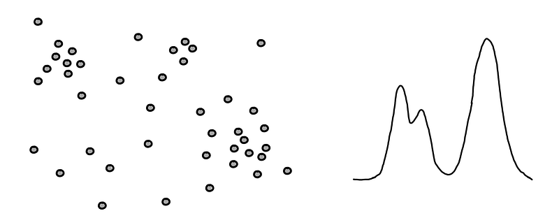
If we go back to the original data set, the reason we identify clusters is that we see 6 dense regions surrounded by sparse and noisy space.
 Encircled regions are highly dense
One way of defining a cluster which is usually consistent with our intuitive notion of clusters is: highly dense regions separated by sparse regions.
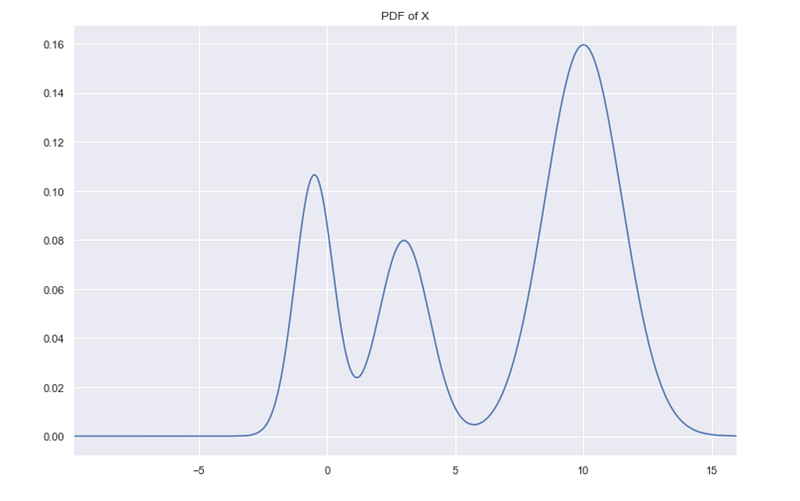
Look at the plot of 1-d simulated data. We can see 3 clusters.
Looking at the underlying distribution
X is simulated data from a mixture of normal distributions, and we can plot the exact probability distribution of X.
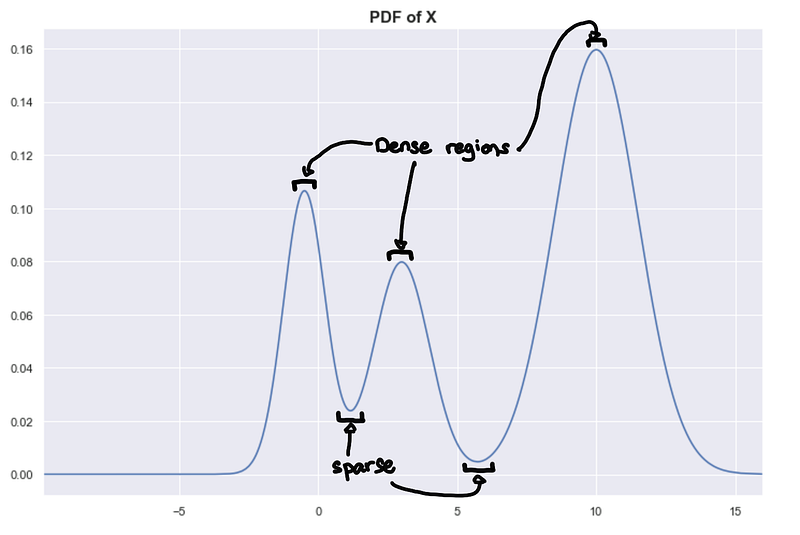 Peaks = Dense regions. Troughs = sparse regions
The peaks correspond to the densest regions and the troughs correspond to the sparse regions. This gives us another way of framing the problem assuming we know the underlying distribution, clusters are highly probable regions separated by improbable regions. Imagine the higher-dimensional probability distributions forming a landscape of mountains and valleys, where the mountains are your clusters.
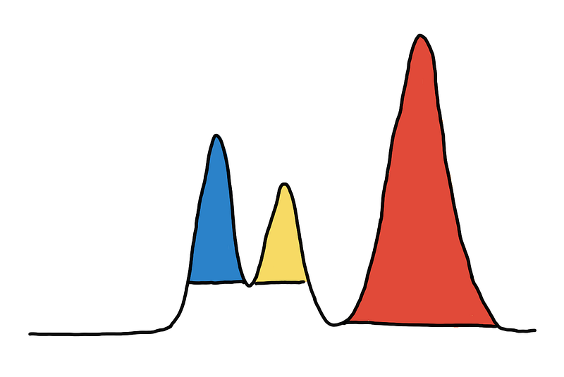 Coloring the 3 peaks/mountains/clusters
For those not as familiar, the two statements are practically the same:
- highly dense regions separated by sparse regions
- highly probable regions separated by improbable regions
One describes the data through its probability distribution and the other through a random sample from that distribution.
The PDF plot and the strip plot above are equivalent. PDF, probability density function, is interpreted as the probability of being within a small region around a point, and when looking at a sample from X, it can also be interpreted as the expected density around that point.
Given the underlying distribution, we expect that regions that are more probable would tend to have more points (denser) in a random sample. Similarly, given a random sample, you can make inferences on the probability of a region based on the empirical density.
Denser regions in the random sample correspond to more probable regions in the underlying distributions.
In fact, if we look at the histogram of a random sample of X, we see that it looks exactly like the true distribution of X. The histogram is sometimes called the empirical probability distribution, and with enough data, we expect the histogram to converge to the true underlying distribution.
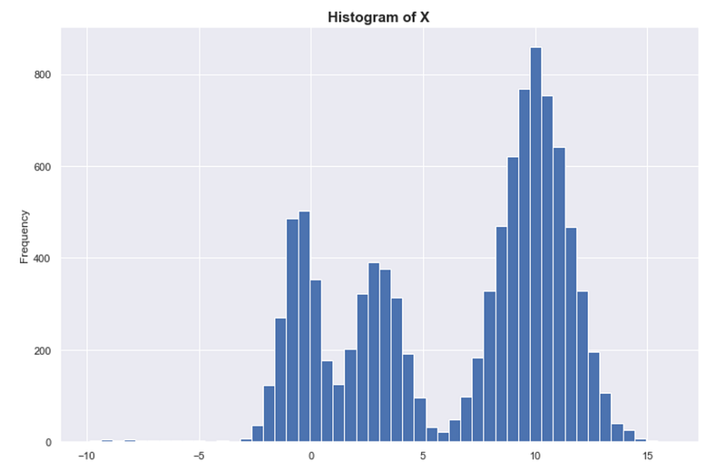
Again, density = probability. Denser = more probable.
But… what’s a cluster?
Sadly, even with our “mountains and valleys” definition of clusters, it can be difficult to know whether or not something is a single cluster. Look at the example below where we shifted one of the modes of X to the right. Although we still have 3 peaks, do we have 3 clusters? In some contexts, we might consider 3 clusters. “Intuitively” we say there are just 2 clusters. How do we decide?
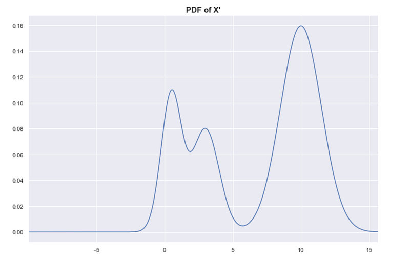
By looking at the strip plot of X’, we can be a bit more certain that there are just 2 clusters.
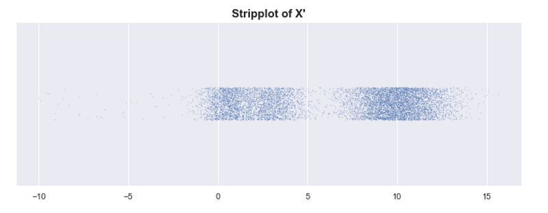
X has 3 clusters, and X’ has 2 clusters. At what point does the number of clusters change?
One way to define this is to set some global threshold for the PDF of the underlying distribution. The connected components from the resulting level-sets are your clusters [3]. This is what the algorithm DBSCAN does, and doing at multiple levels would result to DeBaCl [7].
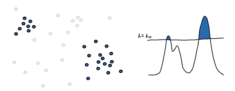
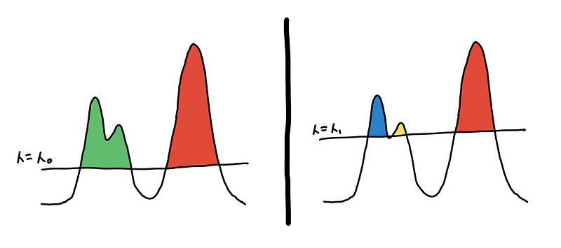 Two different clusterings based on two different level-sets
This might be appealing because of its simplicity but don’t be fooled! We end up with an extra hyperparameter, the threshold 𝜆, which we might have to fine-tune. Moreover, this doesn’t work well for clusters with different densities.
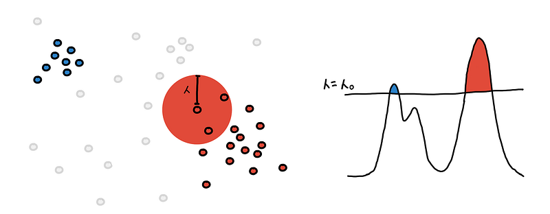
To help us choose, we color our cluster choices as shown in the illustration below. Should we consider blue and yellow, or green only?
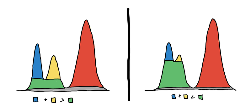 3 clusters on the left vs 2 clusters on the right
To choose, we look at which one “persists” more. Do we see them more together or apart? We can quantify this using the area of the colored regions.
On the left, we see that the sum of the areas of the blue and yellow regions is greater than the area of the green region_._ This means that the 2 peaks are more prominent, so we decide that they are two separate clusters.
On the right, we see that the area of green is much larger. This means that they are just “bumps” rather than peaks. So we say that they are just one cluster.
In the literature [2], the area of the regions is the measure of persistence, and the method is called eom or excess of mass. A bit more formally_, we maximize the total sum of persistence of the clusters under the constraint that the chosen clusters are non-overlapping._
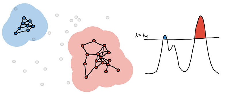
Constructing the hierarchy
By getting multiple level-sets at different values of 𝜆, we get a hierarchy. For a multidimensional setting, imagine the clusters are islands in the middle of the ocean. As you lower the sea level, the islands will start to “grow” and eventually islands will start to connect with one another.
To be able to capture and represent these relationships between clusters (islands), we represent it as a hierarchy tree. This representation generalizes to higher dimensions and is a natural abstraction that is easier to represent as a data structure that we can traverse and manipulate.
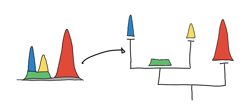 Visualizing the cluster hierarchies as a tree
By convention, trees are drawn top-down, where the root (the node where everything is just one cluster) is at the top and the tree grows downward.
 Visualizing the tree top-down
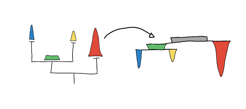
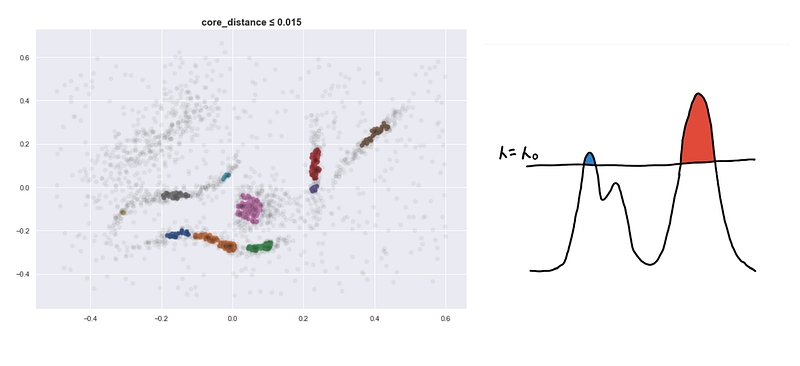
If you are using the HDBSCAN library, you might use the clusterer.condensed_tree_.plot() API. The result of this, shown below, is equivalent to the one shown above. The encircled nodes correspond to the chosen clusters, which are the yellow, blue and red regions respectively.
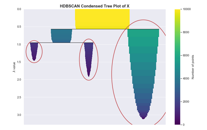 Condensed tree plot from HDBSCAN
When using HDBSCAN, this particular plot may be useful for assessing the quality of your clusters and can help with fine-tuning the hyper-parameters, as we will discuss in the “Parameter Selection” section.
Locally Approximating Density

In the previous section, we had access to the true PDF of the underlying distribution. However, the underlying distribution is almost always unknown for real-world data.
Therefore, we have to estimate the PDF using the empirical density. We already discussed one way of doing this, using a histogram. However, this is only useful for one-dimensional data and becomes computationally intractable as we increase the number of dimensions.
We need other ways to get the empirical PDF. Here are two ways:
- Counting the number of neighbors of a particular point within its 𝜀-radius
- Finding the distance to the K-th nearest neighbor (which is what HDBSCAN uses)
Count Neighbors within 𝜀-radius
For each point, we draw a 𝜀-radius hypersphere around the point and count the number of points within it. This is our local approximation of the density at that point in space.
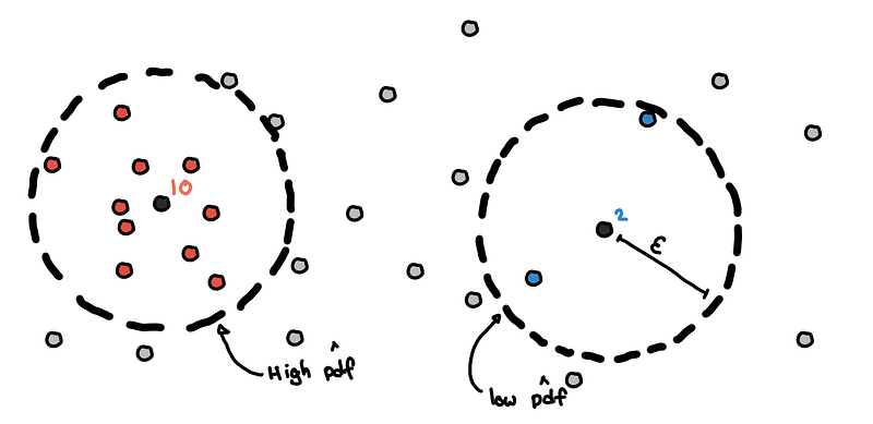 Estimation of pdf using neighbor counts
We do this for every point and we compare the estimated PDF with the true value of the PDF (which we only do now because we simulated the data and its distribution is something we defined).
For our 1-dimensional simulated data, the neighbor count is highly correlated with the true value of the PDF. The higher the number of neighbors results in a higher estimated PDF.
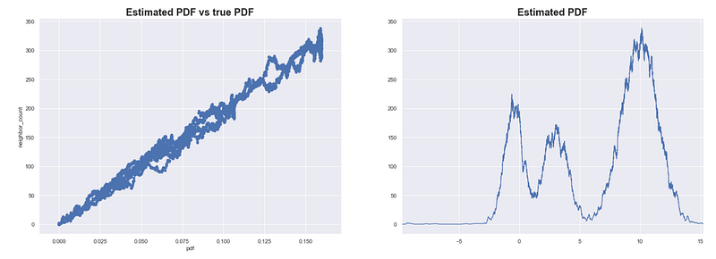 Estimating the PDF of X using neighbor counts eps = 0.1
We see that this method results in good estimates of the PDF for our simulated data X. Note that this can be sensitive to the scale of the data and the sample size. You might need to iterate over several values of 𝜀 to get good results.
Distance to the K-th nearest neighbor
In this one, we get the complement of the previous approach. Instead of setting 𝜀 then counting the neighbors, we determine the number of neighbors we want and find the smallest value of 𝜀 that would contain these K neighbors.
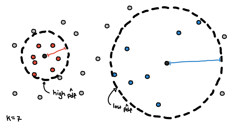 Core distances for K = 7
The results are what we call core distances in HDBSCAN. Points with smaller core distances are in denser regions and would have a high estimate for the PDF. Points with larger core distances are in sparser regions because we have to travel larger distances to include enough neighbors.
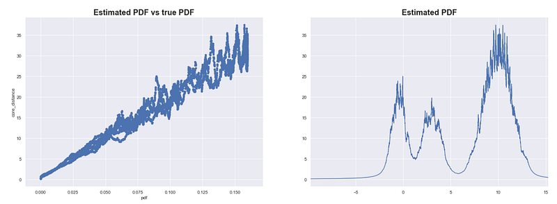 Estimating the PDF of X using core distance where K = 100
We try to estimate the PDF on our simulated data X. In the plots above, we use 1/core_distance as the estimate of the PDF. As expected, the estimates are highly correlated with the true PDF.
While the previous method was sensitive to both the scale of the data and the size of the data set, this method is mainly sensitive to the size of the data set. If you scale each dimension equally, then all core distances will proportionally increase.
The key takeaway here is:
- core distance = estimate of density
- (recall that) density = probability
- core distance = some estimate of the PDF
So when we refer to a point’s core distance, you can think of implicitly referring to the PDF. Filtering points based on the core distance is similar to obtaining a level-set from the underlying distribution.
Whenever we have core_distance ≤ 𝜀, there is an implicit pdf(x) ≥ 𝜆 happening. There is always a mapping between 𝜀 and 𝜆, and we will just use symbol 𝜆 for both core distances and the PDF for simplicity.
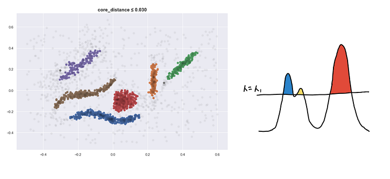
Find the level-set and color the regions
Recall that in the previous examples, we get a level-set from the PDF and the resulting regions are our clusters. This was easy because a region was represented as some shape. But when we are dealing with points, how do we know what the different regions are?
We have a small data set on the left and its corresponding PDF on the right.
 The PDF is not “accurate”
The first step is to find the level-set at some_𝜆_. We filter for regions pdf(x) ≥ 𝜆 or filter for points with core_distance ≤ 𝜆 .
Now we need to find the different regions. This is done by connecting “nearby” points to each other. “Nearby” is determined by the current density level defined by 𝜆 and we say that two points are near enough if their Euclidean distance is less than 𝜆.
We draw a sphere with radius 𝜆 around each point.
We connect the point to all points within its 𝜆-sphere. If two points are connected they belong to the same region and should have the same color.

Do this for every point and what we are left with are several connected components. These are our clusters.
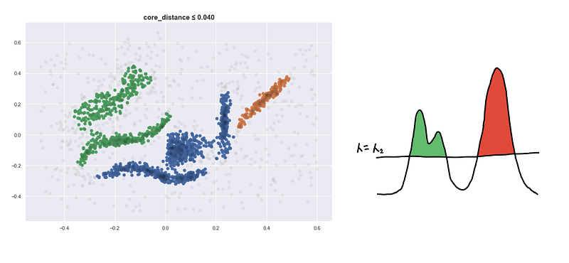
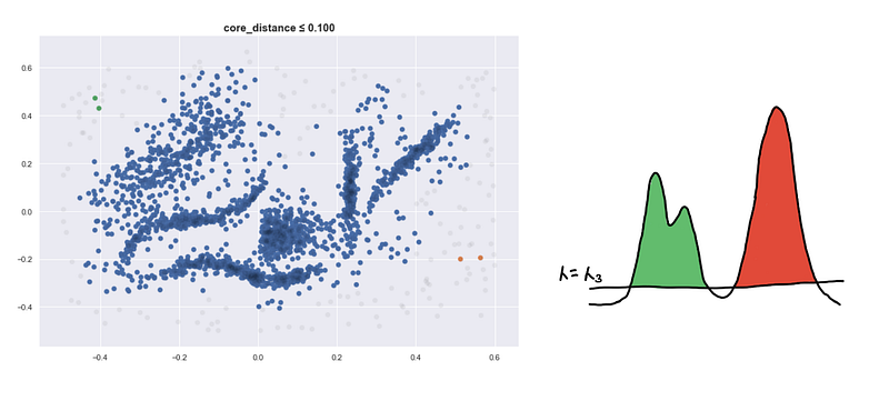
This is the clustering you get at some level-set. We continue to “lower the sea” and keep track as new clusters appear, some clusters grow and eventually some merge together.
Lowering the sea level
Here are four visualizations where we show 4 clusters at 4 different level-sets. We keep track of the different clusters so that we can build the hierarchy tree which we have previously discussed.
Defining a new distance metric
I’d like to highlight that points can be inside the 𝜆-_sphere but they still won’t be connected. They have to be included in the level-set first so _𝜆 should be greater than its core distance for the point to be considered.
The value of 𝜆 at which two points finally connected can be interpreted as some new distance. For two points to be connected they must be:
- In a dense enough region
- Close enough to each other
For a and b, we get the following inequalities in terms of 𝜆 :
core_distance(a)≤ 𝜆core_distance(b)≤𝜆distance(a, b)≤𝜆
(1) and (2) are for the “In a dense enough region”. (3) is for the “Close enough to each other”
Combining these inequalities, the smallest value of 𝜆 needed to be able to directly connect a and b is
mutual_reachability_distance(a, b) = max(
    core_distance(a),
    core_distance(b),
    distance(a, b)
)
This is called the mutual reachability distance in HDBSCAN literature.
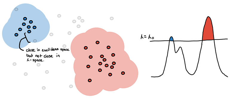
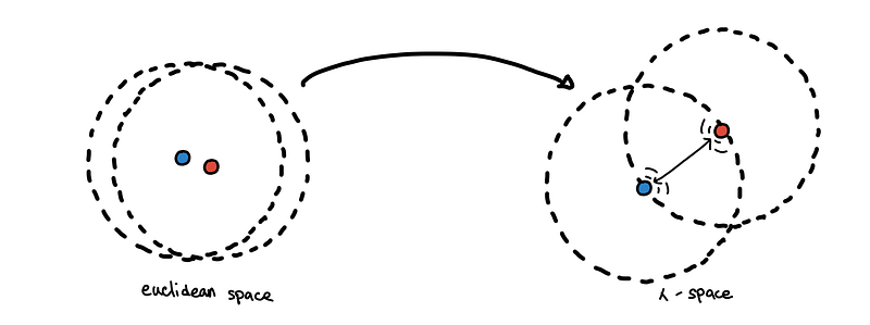
Projection to 𝜆-space
Note: This “lambda space” is a term not found in the literature. This is just for this blog.
Instead of using Euclidean distance as our metric, we can now use the mutual reachability distance as our new metric. Using it as a metric is equivalent to embedding the points in some new metric space, which we would simply call 𝜆-space*.
 The repelling effect. Circles represent the core distance of each point.
This has an effect of spreading apart close points in sparse regions.
Due to the randomness of a random sample, two points can be close to each other in a very sparse region. However, we expect points in sparse regions to be far apart from each other. By using the mutual reachability distance, points in sparse regions “repel other points” if they are too close to it, while points in very dense regions are unaffected.
Below is a plot of the points in 𝜆-space projected using Multidimensional Scaling to show its effect more concretely.
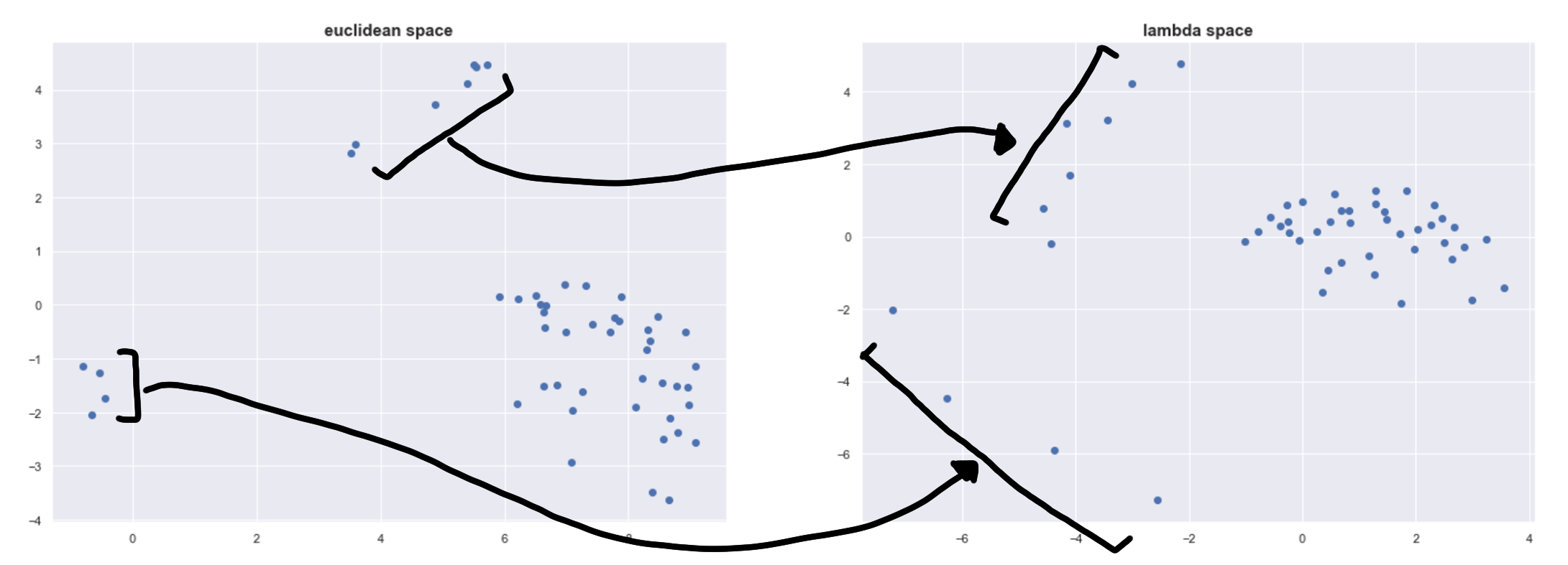
We can see this repelling effect on the left and on top. The four points on the left are spread out the most because they are in a very sparse space.
Building the hierarchy tree using 𝜆-space
Recall that to build the hierarchy tree, we have the following steps:
- Set 𝜆 to the smallest value of the core distance
- Filter for the points in the level-set
- Connect points that are at most 𝜆 units apart
- Create new clusters, expand new clusters and merge clusters
- Set 𝜆 to the next smallest value of the core distance and go to step (2)
Notice that when doing step (3), connecting two points that already belong the same connected component is useless. What really matters are the connections across clusters. The connection that would connect two clusters correspond to the pair of points from two different clusters with the smallest mutual reachability distance. If we ignore these “useless” connections and only note the relevant ones, what we are left with is an ordered list of edges that always merge two clusters (connected components).
 Connections dropping the “useless” edges… Is that a minimum spanning tree forming?
This might sound complicated but this can be simplified if we consider the mutual reachability distance as our new metric_:_
- Embed the points in 𝜆-space and consider each point as a separate cluster
- Find the shortest distance between two points from two different clusters
- Merge the two clusters
- Go back to step (2) until there is only one cluster
If this sounds familiar, it’s the classical agglomerative clustering. This is just the single linkage clustering in 𝜆-space!
Doing single linkage clustering in Euclidean space can be sensitive to noise since noisy points can form spurious bridges across islands. By embedding the points in 𝜆-space, the “repelling effect” makes the clustering much more robust to noise.
Single linkage clustering is conveniently equivalent to building a minimum spanning tree! So we can use all the efficient ways of constructing the MST from graph theory.
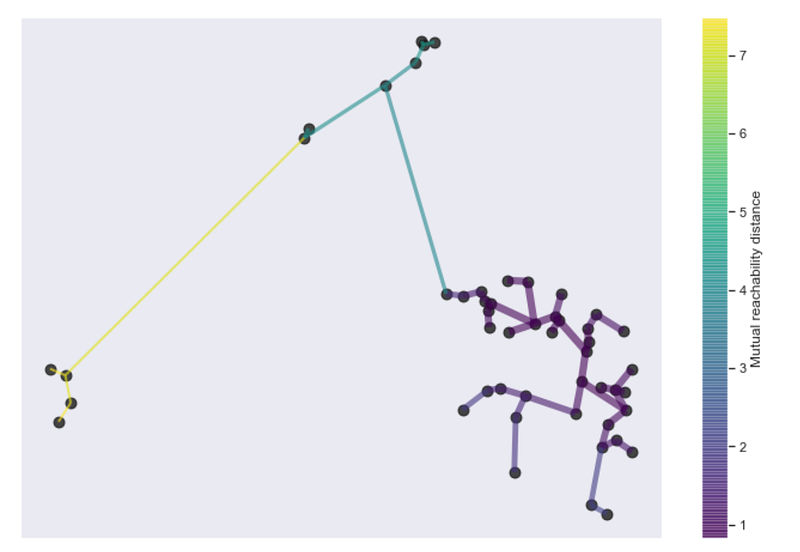 Minimum spanning tree from HDBSCAN
Parameter Selection and Other Notes

Now we go through notes regarding the main parameters of HDBSCAN, min_samples and min_cluster_size , and HDBSCAN in general.
min_samples
Recall our simulated data X, where we are trying to estimate the true PDF.
We try to estimate this using the core distances, which is the distance to the K-th nearest neighbor. The hyperparameter K is referred to as min_samples in the HDBSCAN API.
These are just empirical observations from the simulated data. We compare the plot we have above with the estimated PDF based on different values of min_samples .
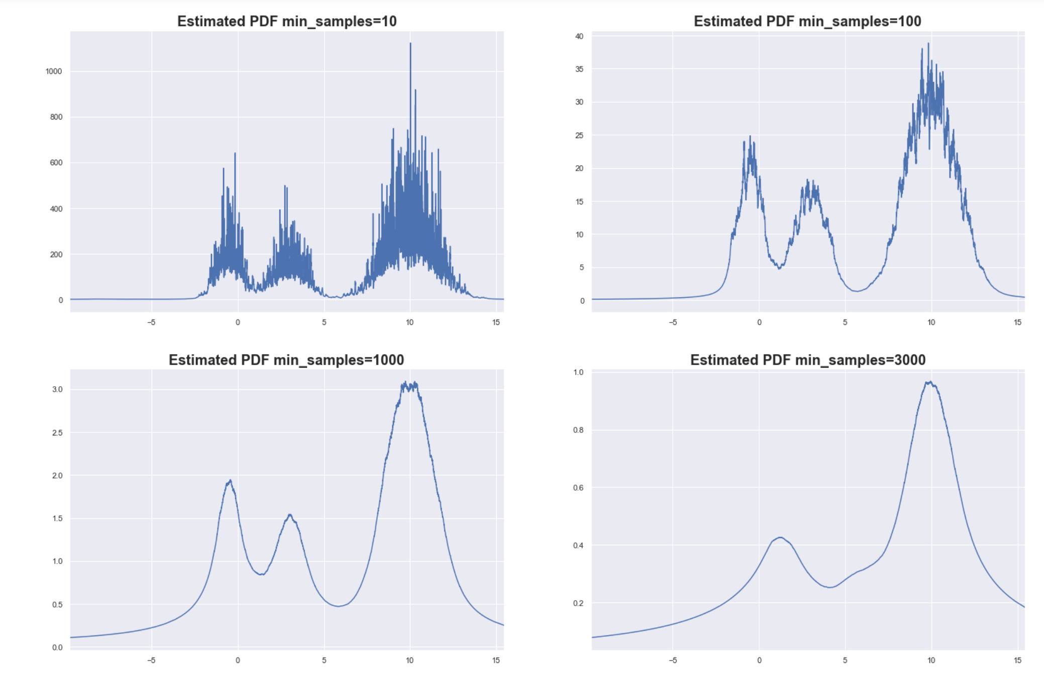 Estimated PDF based on a sample size of 10000
As you can see, setting min_samples too low will result in very noisy estimates for the PDF since the core distances become sensitive to local variations in density. This can lead to spurious clusters or some big cluster can end up fragmenting into many small clusters.
Setting min_samples too high can smoothen the PDF too much. The finer details of the PDF are lost, but at least you are able to capture the bigger more global structures of the underlying distribution. In the example above, the two small clusters were “blurred” into just one cluster.
Determining the optimal value for min_samples might be difficult, and is ultimately data-dependent. Don’t be mislead by the high value of min_samples that we are using here. We used 1-d simulated data that has smooth variations in density across the domain and only 3 clusters. Typical real-world data are wholly different characteristics and smaller values for min_samples are enough.
The insight on the smoothing effect definitely applicable in other datasets. Increasing the value of min_samples smoothens the estimated distribution so that small peaks flattened and we get to focus only on the denser regions.
The simplest intuition for what
min_samplesdoes is provide a measure of how conservative you want you clustering to be. The larger the value ofmin_samplesyou provide, the more conservative the clustering – more points will be declared as noise, and clusters will be restricted to progressively more dense areas. [7]
Be cautious, one possible side-effect of this is that it might require longer running times because you have to find more “nearest neighbors” per point, and might require more memory.
min_cluster_size
Notice that the underlying PDF that we are trying to estimate is very smooth, but because we are trying to estimate with a sample, we expect some variance in our estimates.
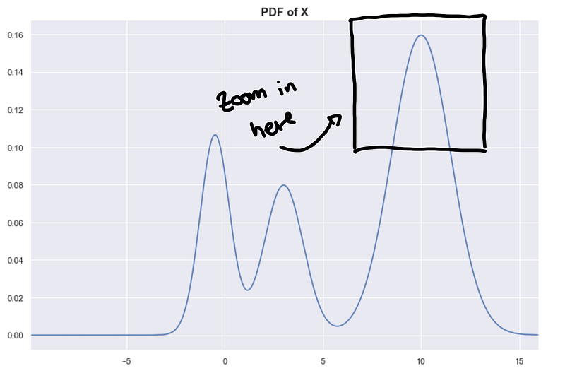
This results in a “bumpy” estimated PDF. Let’s focus on a small area of the PDF to illustrate this.
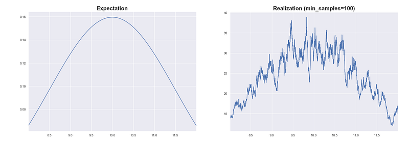
What is the effect of this bumpiness in the hierarchy tree? Well, this affects the persistence measures of the clusters.
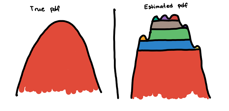
Because the little bumps are interpreted as mini-clusters, the persistence measures of the true clusters are divided into small segments. Without removing the bumps, the main cluster may not be seen by the excess of mass method. Instead of seeing a large smooth mountain, it sees it as a collection of numerous mini-peaks.
To solve this, we flatten these small bumps. This is implemented by “trimming” the clusters that are not big enough in the hierarchy tree. The effect of this is that the excess of mass method is no longer distracted by the small bumps and can now see the main cluster.
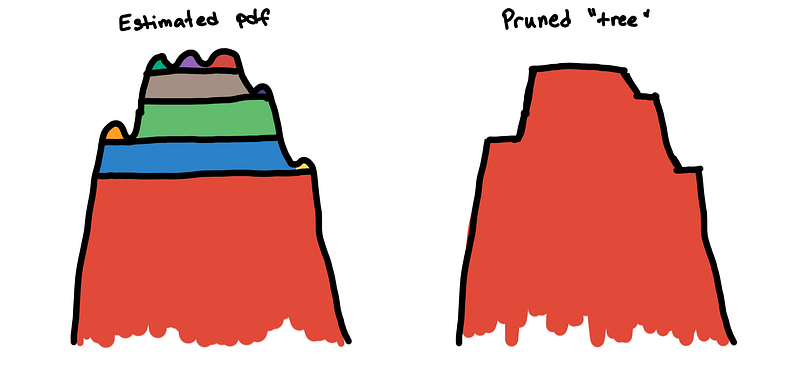
min_cluster_size dictates the maximum size of a “bump” before it is considered a peak. By increasing the value of min_cluster_size you are, in a way, smoothening the estimated PDF so that the true peaks of the distributions become prominent.
Since we have access to the true PDF of X, we know a good value of min_samples which will result in a smooth estimated PDF. If the estimates are good, then the min_cluster_size is not as important.
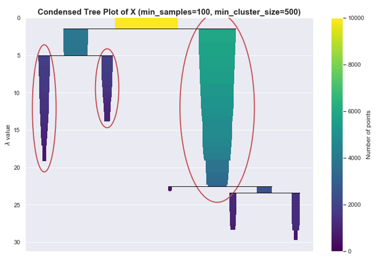
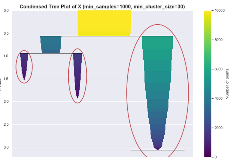 Ideal condensed tree
Let’s say we used a smaller value for min_samples and set it to 100. If you look at the PDF plot it has the general shape of the PDF but there is noticeable variance.
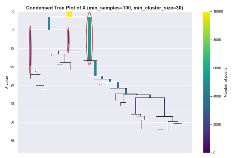
Even though we know there should only be 3 peaks, we see a lot of small peaks.
If you see a more extreme version of this, perhaps you can’t even see the colors of the bars anymore, then that would mean that the hierarchy tree is complex. Maybe it’s because of the variance of the estimates or maybe that’s really how the data is structured. One way can address this is by increasing min_cluster_size, which helps HDBSCAN simplify the tree and concentrate on bigger more global structures.
Data Transformations
Although we’ve established that HDBSCAN can find clusters even with some arbitrary shape, it doesn’t mean there is no need for any data transformations. It really depends on your use cases.
Scaling certain features can increase or decrease the influence of that feature. Also, some transformations such as log and square root transform can change the shape of the underlying distribution altogether.
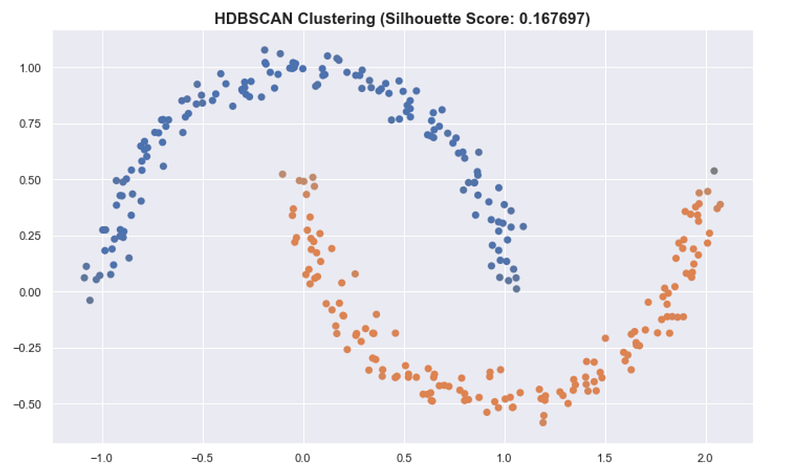
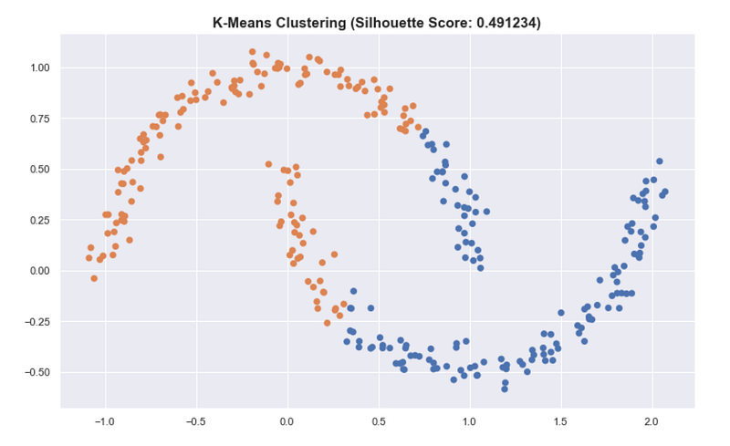
Assessing cluster quality
Another insight that should be noted is that classical ways of assessing and summarizing clusters may not be as meaningful when using HDSCAN. Some metrics such as the silhouette score work best when the clusters are round.
For the “moons” dataset in sklearn, K-means has a better silhouette score than the result of HDBSCAN even though we see that the clusters in HDBSCAN are better.
This also applies in summarizing the clusters by getting the mean of all the points of the cluster. This is very useful for K-means and is a good prototype of the cluster. But for HDBSCAN, it can be problematic because the clusters aren’t round.
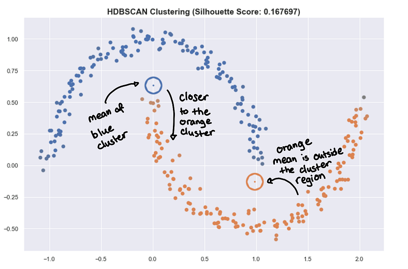 The hollow circles are the “centroids” of the cluster.
The mean point can be far from the actual cluster! This can be very misleading and can lead to wrong insight. You might want to use something like a medoid which is a point that is part of the cluster that is closest to all other points. But be careful, you can lose too much information to try to summarize a complex shape with just one point in space.
This all really depends on what kind of clusters you prefer and the underlying data you are processing. See Henning’s talk [5] for an overview on cluster assessment.
HDBSCAN Recap

We’re done! We have discussed the core ideas of HDBSCAN! We will breeze through some specific implementation details as a recap.
A rough sketch of the HDBSCAN’s implementation goes as follows:
- Compute the core distances per points
- Use the
mutual_reachability(a, b)as a distance metric for each a, b - Construct a minimum spanning tree
- Prune the tree
- Choose the clusters using “excess of mass”
Compute the core distances per point
This basically is the way we “estimate the underlying pdf”
Minimum spanning tree using mutual reachability distance
The mutual reachability distance is a summary at what level of 𝜆 two points together will connect. This is what we use as a new metric.
Building the minimum spanning tree is equivalent to single linkage clustering in 𝜆-space, which is equivalent to iterating through every possible level-set and keeping track of the clusters.
Prune the resulting tree
Briefly, since what we have is just an estimate PDF, we expect to have some variance. So even if the underlying distribution is very smooth, the estimated PDF can be very bumpy, and therefore result to a very complicated hierarchy tree.
We use the parameter min_cluster_size to smoothen the curves of the estimated distribution and as a result, simplifying the tree into the condensed_tree_
Choose the clusters using “excess of mass”
Using the condensed tree, we can estimate the persistence of each cluster and then calculate for the optimal clustering as discussed in the previous section.
References
[1] https://hdbscan.readthedocs.io/en/latest/how_hdbscan_works.html
[2] McInnes, Leland, and John Healy. “Accelerated hierarchical density clustering.” arXiv preprint arXiv:1705.07321 (2017).
[3] John Healy. HDBSCAN, Fast Density Based Clustering, the How and the Why. PyData NYC. 2018
[4] Hastie, Trevor, Robert Tibshirani, and Jerome Friedman. The elements of statistical learning: data mining, inference, and prediction. Springer Science & Business Media, 2009.
[5] Christian Hennig. Assessing the quality of a clustering. PyData NYC. 2018.
[6] Alessandro Rinaldo. DeBaCl: a Density-based Clustering Algorithm and its Properties.
[7] https://hdbscan.readthedocs.io/en/latest/parameter_selection.html
[8] Campello, Ricardo JGB, Davoud Moulavi, and Jörg Sander. “Density-based clustering based on hierarchical density estimates.” Pacific-Asia conference on knowledge discovery and data mining. Springer, Berlin, Heidelberg, 2013.
Photos by Dan Otis on Unsplash, Creative Vix from Pexels, Egor Kamelev from Pexels, Jesse Gardner on Unsplash, Casey Horner on Unsplash, Keisuke Higashio on Unsplash, Kim Daniel on Unsplash